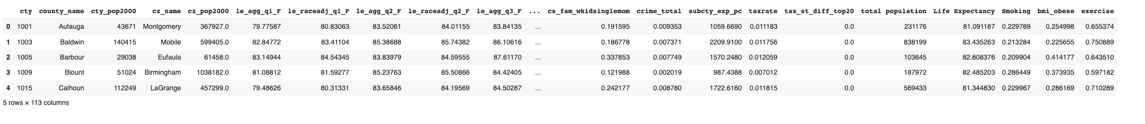
The histogram demonstrates the distribution of life expectancy values in the demographic dataset. The x-axis represents the life expectancy values and the y-axis represents the frequency of occurrence for each value.The histogram shows a roughly bell-shaped distribution, which suggests that the data follows a normal distribution.The mean life expectancy is 83, which is close to the peak of the histogram.
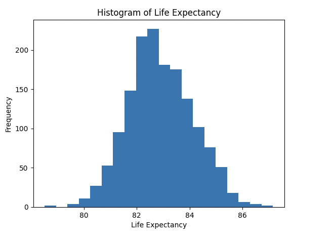
Based on the analysis of the correlation coefficient and scatter plot, there appears to be a significant negative correlation between smoking rate and life expectancy. This suggests a causal relationship in which an increase in smoking rate is associated with a decrease in life expectancy.
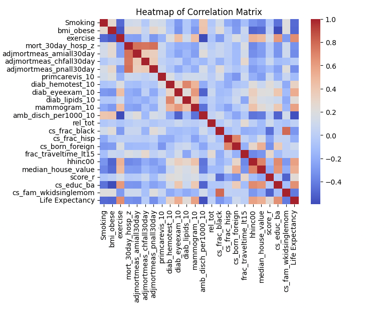
The heatmap demonstrates the correlation between the demography factors. Based on the map, I can notice a strong positive correlation between exercise, household income, and education in life expectancy and a negative correlation between smoking, and obese in life expectancy.
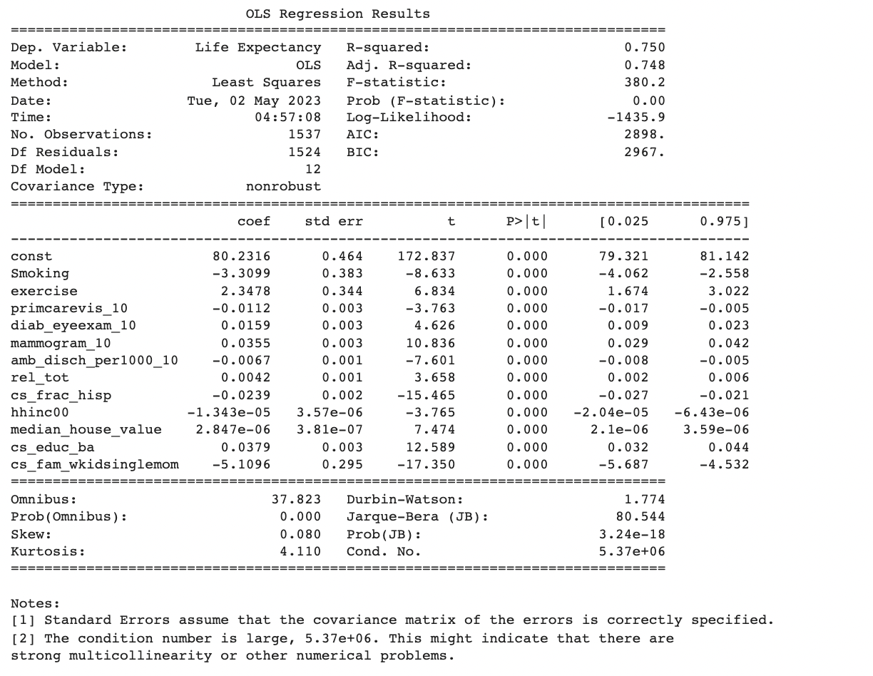
I remove all insignificant variables and rerun OLS, as I have no reason to believe any of these specific variables are important regardless of regression results. We see that adjusted R^2 decreases from 0.756 to 0.748, which is not a large magnitude. I also see that the constant is now 80.2316, which seems close to the average overall life expectancy, meaning this model is more accurate.
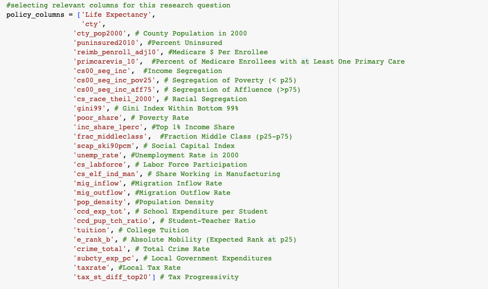
I selected a subset of the main dataframe to focus on policy-related variables. They includes Poverty Rate, Labor Force Participation, Local Tax Rate, etc.
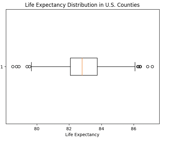
The boxplot shows the distribution of life expectancy in U.S. counties. The 25th percentile is around 82 years old. The median is around 82.7 years old. The 75th percentile is a bit less than 84 years old. This distribution is pretty concentrated with small deviation from the median. It is also right skewed with some outliers on either side.
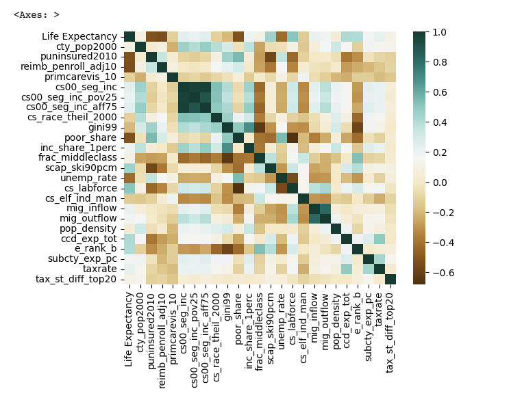
From the heatmap, there are some relatively strong correlation (r>0.4) between life expectancy and scap_ski90pcm, cs_labforce, ccd_exp_tot, e_rank_b. These variables correspond to Social Capital Index, Labor Force Participation, School Expenditure per Student, Absolute Mobility
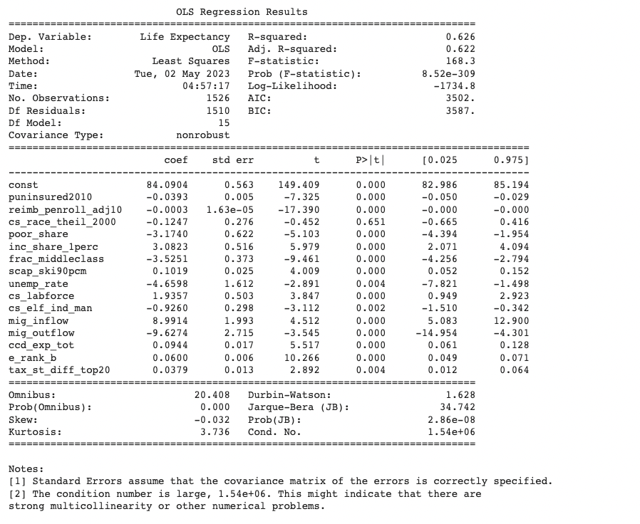
The R squared is 0.626 at this point, which indicates a relatively strong correlation between the selected columns and life expectancy. These columns will be considered further in our ML models. I also noticed that some columns have negative coefficient, which means as these variables increase, the county's predicted life expectancy decreases.